EXPLOIT.ORG
Senior UI/UX Designer
A website for a security team, built with AI.
I designed the EXPLOIT.ORG website and used AI to generate the entire site. The homepage introduces the team’s work, shows how TKeeper handles a sample action and gives visitors a way to reach the research and contact the team.
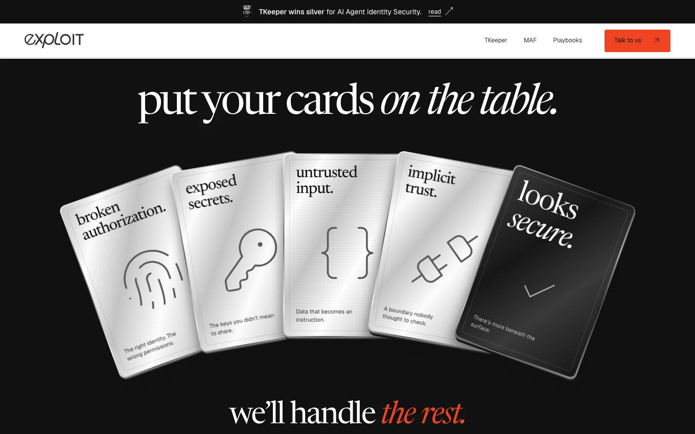
Give each risk a card
The homepage makes the headline physical. Five metallic cards fan across a dark background, each carrying a label, an icon and a brief explanation. The last card changes to black and closes the sequence.
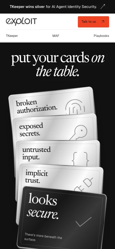
On a phone, the cards stack vertically. Each label stays readable while the overlap preserves the visual relationship between the cards.
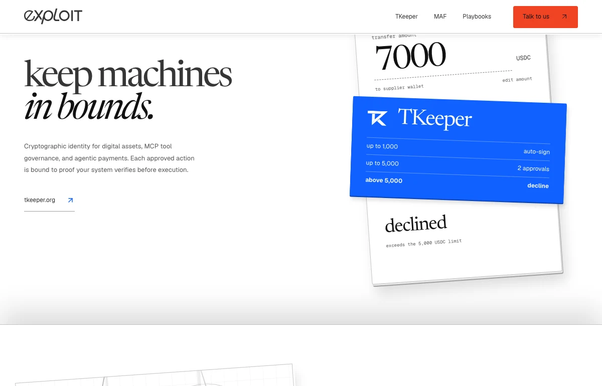
Show a policy decision in context
The TKeeper section gives the visitor a concrete example. A sample request, the relevant policy and its outcome appear together, so the reader can connect the decision with the rule that caused it. The blue policy card distinguishes the product moment from the rest of the homepage.
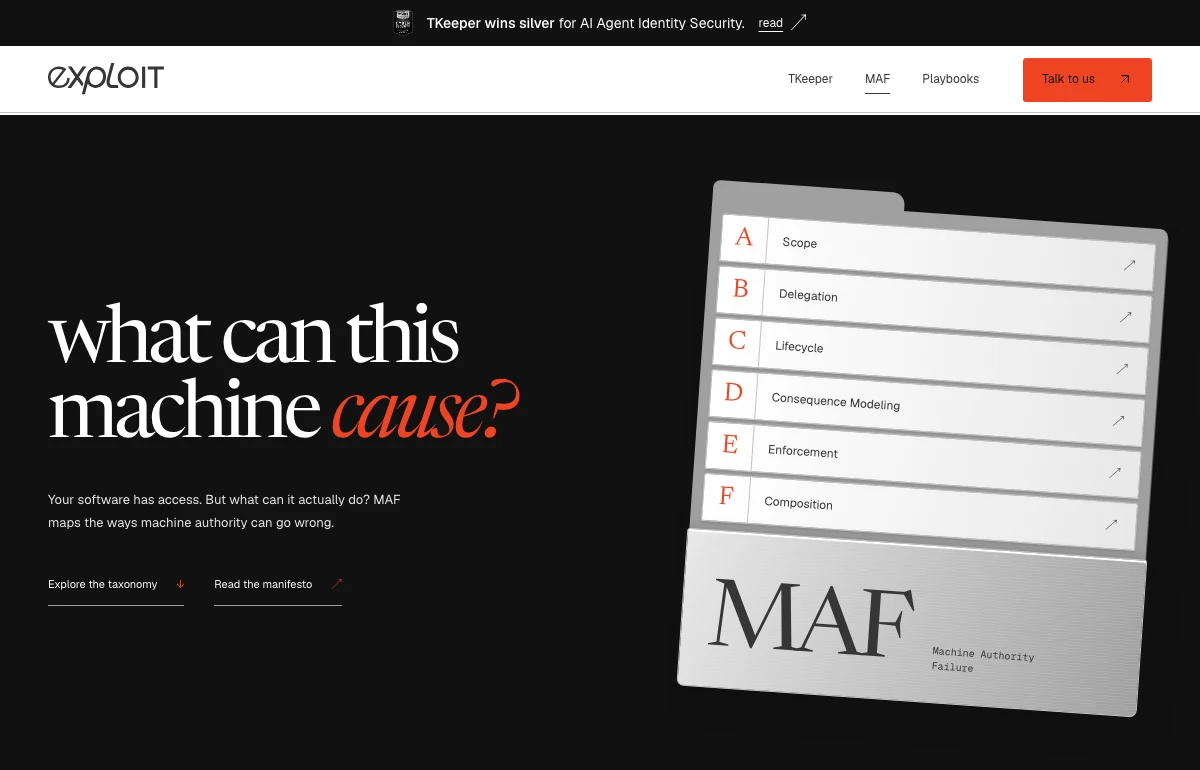
Make the research easy to enter
The Machine Authority Failure page starts with one question about what a machine can cause. Six labelled categories give readers an overview. Separate links lead into the taxonomy and the manifesto, so visitors can start with either the framework or its rationale.